Function and Aesthetic in In Other Waters: An Interview

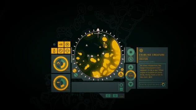
In Other Waters is one of those games with instant visual appeal. Set underwater on an alien planet, a xenobiologist named Ellery Vas is out to find her missing partner after contact is lost with her research station. Breaking with convention, the player acts not as the game’s protagonist, but as her helper, assisting her by serving as the artificial intelligence within a special dive suit as they set out into watery lands unknown. Aided by a wordless user interface that must be navigated to both collect life forms and explore the ocean floor, its design relies on a perfect marriage between intuition and style. Its visual elements, evoking everything from Yellow Submarine to The Life Aquatic with Steve Zissou, are irresistibly attractive. It’s exactly this melding of function and aesthetic that developer Gareth Damian Martin, with his background in graphic and motion design and procedural poetry, sought to build.
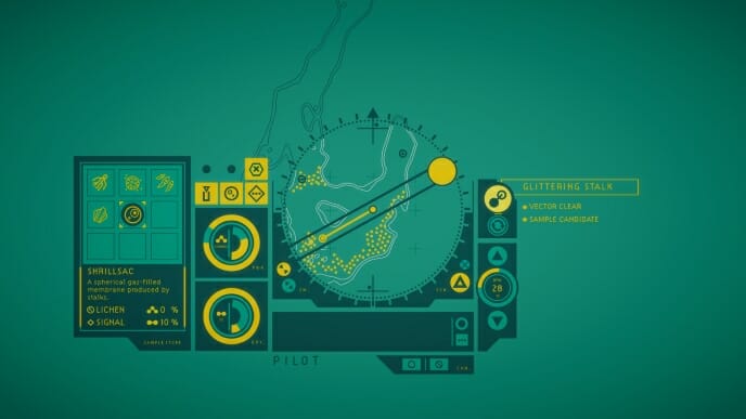
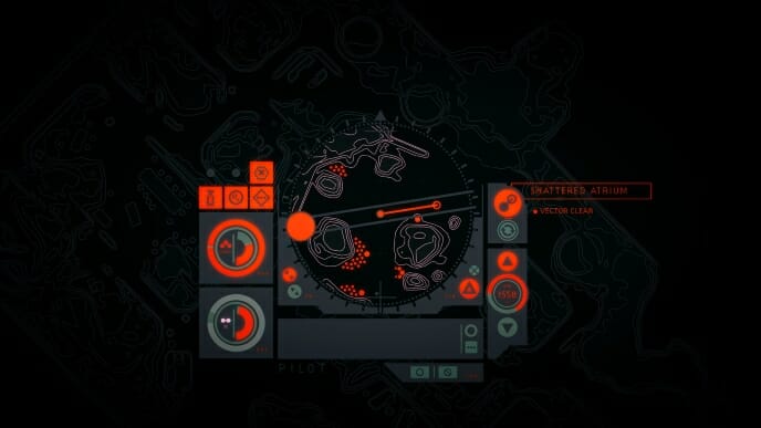
Creating a user interface that is both intuitive and forgiving is harder than it looks. The visuals must be clean and uncluttered, but compelling enough to encourage experimentation. In In Other Waters, the gameplay revolves completely around the suit’s panel, a blue and gold arrangement of dials and screens that navigate the player and Ellery Vas across the ocean floor. Its distinctive two-color palette, Martin tells Paste by email, was chosen specifically to make the game recognizable. Citing The Shrouded Isle, he says, “It’s quite rare to take such a limiting decision in games. But as In Other Water’s aesthetic is all about limitation and abstraction as being generative for the player’s imaginations, it seemed to fit. The turquoise came from the color of the Aegean, where I was swimming when I first dreamt-up the game, and the yellow-gold is definitely in that Cousteau world, but I wanted it to be elevated, more saturated, and less nostalgic.” The interface of the dive suit, the central mechanism through which the player experiences the game, meanwhile, is the result of Martin’s fascination with anime of the ‘80s and ‘90s, like Neon Genesis Evangelion and Gundam Wing. “There’s a beautiful and bold sense of abstraction to those interfaces which sits apart from the current trend for layers and layers of thin, overly complex holographic interfaces, which I find a bit dull and played-out.”
Martin also looked at Japanese industrial design from that same era, especially audio equipment like radios and synthesizers, taking a pointed interest in the Panasonic Cougar7. He became so fond of the device, he even imported a replica to play with while designing the UI of the game. The result is less busy than the Cougar7, but it retains the utilitarian look that lends the aesthetic some scientific credibility. “I followed that same relationship between radial dials and cut-off square panels that you can see in that radio in a lot of the UI, and wanted to maintain that same sense of asymmetric functionality, rather than perfectly balanced elegance that I saw in that design. I tend to spend a lot of time gathering references like that until I have a really clear sense in my head what will work and what won’t and can then operate on instinct…. It doesn’t take long before you know exactly what will and won’t fit within the very limited color and shape language you set for yourself.”
For a game to rely on a user interface to drive the momentum’s narrative, iteration is key. In In Other Waters, players have to figure out how to use the suit to observe specimens, collect samples and consume them for fuel, as well as gauge power and air supply. Even navigating the ocean floor is done through an on-screen panel. To test how the audience responded to the visual communication of the interface, Martin spent a lot of time at conventions and shows looking over players’ shoulders to see their responses to the design. The goal was to let the audience play and experiment with the controls, but not provide too much friction to be enjoyable. “One thing that was really important to me was also to draw on the ‘reality’ of the actions I was representing, so that the player could follow the logic of their actions even if they couldn’t precisely understand the symbol language. The game’s central compass and rotational lubber, for example, absolutely comes from how you navigate when scuba diving, carefully setting headings by degree so you don’t get lost. And when I was building the sampling system I looked at how deep-sea ROVs take samples in real life, and the slightly ponderous process of aligning a vacuum tube with a subject and then clamping it for extraction. I think this helps the player feel in touch with the world even if they can’t see it, and gives a sense of tactility that is important for understanding what you are doing, rather than just hitting buttons and seeing what happens.
-

-
-
-
-
-
-
-
-
-
-
-
-
-
-
-
-
-
-
-
-
-
-
-
-
-
-
-
-
-
-
-
-
-
-
-
-
-
-
-